How to add responsive HTML table in Blogger.
Are you still struggling to add a responsive HTML table to your Blogger blog post?
In this article, I will share you with the easiest way to insert a responsive HTML table to your blogger website without using any JavaScript.
You just need a simple HTML table generator that will help you generate the code required to create the table.
I have seen multiple tutorials on the internet that shows how to add a table in blogger, but they are not responsive and the design is outdated.
That’s why I prepared this article to guide you on how to insert a responsive and beautifully designed HTML table into the blogger using an online table generator.
You can also set the background color, set different fonts, animated hover effects, and more. So, let’s start.
How to create a responsive table in Blogger?
You can easily create a stylish and responsive table and add it to the blogger [Blogspot] blog post by following this guide.
- Open the Blogger dashboard and Add a new Post or open any existing Blog post.
- Now switch to HTML View and Paste the Below HTML and CSS code.
- Change the data according to your Need
- Now publish the page and your Responsive HTML table is added to your Blogger website.
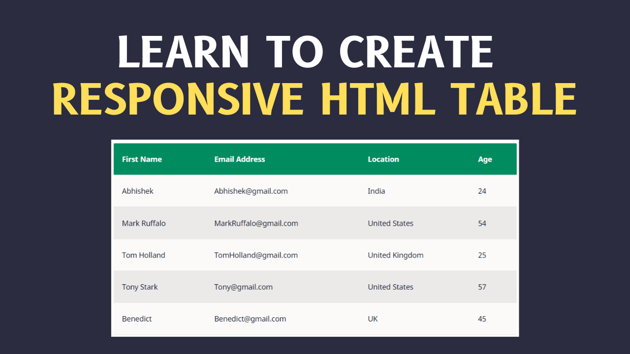
Code for HTML Table
<div class="table">
  <table style="white-space: nowrap;">
    <thead>
      <tr>
        <th>No</th>
        <th>Column_1</th>
        <th>Column_2</th>
        <th>Column_3</th>
        <th>Column_4</th>
        <th>Column_5</th>
      </tr>
    </thead>
    <tbody>
      <tr>
        <td>1</td>
        <td>Abhishek</td>
        <td>Padhi</td>
        <td>90</td>
        <td>96</td>
        <td>99</td>
      </tr>

      <tr>
        <td>2</td>
        <td>Udit</td>
        <td>Narayan</td>
        <td>95</td>
        <td>98</td>
        <td>99</td>
      </tr>

      <tr>
        <td>3</td>
        <td>Rohit</td>
        <td>Thakur</td>
        <td>90</td>
        <td>93</td>
        <td>89</td>
      </tr>

    </tbody>
  </table>
</div>


<style>
.table {
    display: block;
    overflow-y: hidden;
    overflow-x: auto;
    scroll-behavior: smooth;
}

 .table thead {
    display: table-header-group;
    vertical-align: middle;
    border-color: inherit;
    color: white;
    background: darkcyan;
}

tr {
    display: table-row;
    vertical-align: inherit;
    border-color: inherit;
}

 table th {
    padding: 16px;
    text-align: inherit;
    border-bottom: 1px solid black;
   color:white!important;
}

  tbody {
    display: table-row-group;
    vertical-align: middle;
    border-color: inherit;
}

 table:not(.tr-caption-container) {
    min-width: 100%;
    border-radius: 3px;
}
</style>
Video Guide
Here, you can watch the Updated Tutorial on Responsive HTML table in Blogger.

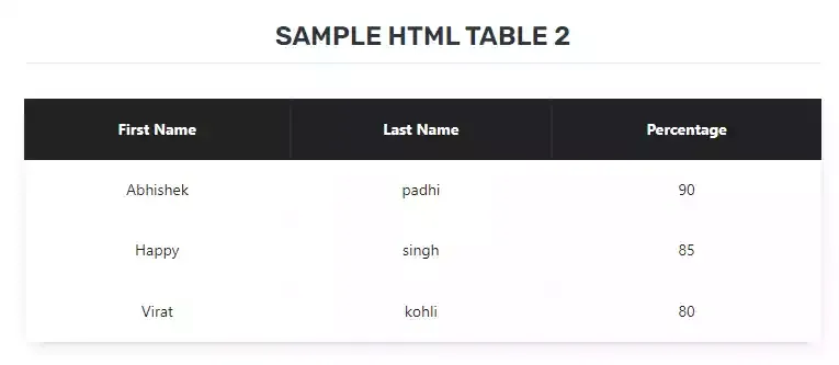
Advanced HTML CSS Responsive Table Generator
In this advanced Responsive HTML table generator, you have more flexibility on how the table looks like. Here you can customize cell padding, cell color, text color for desktop and mobiles.
You can also use this tool to generate a pricing table for your blogger website.
If you want to Add an HTML table with a different look then you can use the below code.
 <div class="table-container">
      <h2 class="table-heading">Sample HTML Table 2</h2>

      <table style="white-space: nowrap;">
        <thead>
          <tr>
            <th>First Name</th>
            <th>Last Name</th>
            <th>Percentage</th>
          </tr>
        </thead>

        <tbody>
          <tr>
            <td data-heading="First Name">Abhishek</td>
            <td data-heading="Last Name">padhi</td>
            <td data-heading="Percentage">90</td>
          </tr>

          <tr>
            <td data-heading="First Name">Happy</td>
            <td data-heading="Last Name">singh</td>
            <td data-heading="Percentage">85</td>
          </tr>

          <tr>
            <td data-heading="First Name">Virat</td>
            <td data-heading="Last Name">kohli</td>
            <td data-heading="Percentage">80</td>
          </tr>
        </tbody>
      </table>
    </div>

<style>
    .table-container {
  font-family: system-ui;
}

 .table-container table {
    width: 100%;
    background: #fff;
    color: #222;
    box-shadow: 0 4px 15px -8px rgba(0, 0, 0, 0.4);
    border-collapse: collapse;
}

.table-container h2.table-heading {
  text-align: center;
  text-transform: uppercase;
  font-size: 24px;
  margin-bottom: 32px;
  border-bottom: 1px solid #eee;
  padding-bottom: 8px;
}

.table-container table {
  width: 100%;
  background: #fff;
  color: #222;
  padding: 24px;
  box-shadow: 0 4px 15px -8px rgba(0, 0, 0, 0.4);
  border-collapse: collapse;
}

.table-container table thead tr {
  background: #222;
  color: #fff;
}

.table-container table td,
.table-container table th {
  padding: 16px 32px;
  text-align: center;
}

.table-container table tr {
  border-bottom: 1px solid #eee;
}

  table thead th {
    color: white!important;
  }
</style>
You can check the screenshot attached below to know how it looks.
Conclusion
Most of the HTML table generator for Blogger that I found online doesn’t works perfectly. That’s why you need to use the Table code and modify the data according to your need. It is super responsive on all types of devices. I use this method to add the table in my blogger post.
I hope you like this method. What is your thought about this HTML table, let me know in the comment section. Also, don’t forget to share this with your friends on social media.
Read Also: How to add a Table of contents on Blogger website.


How to create a pagination for table
You have a talent for breaking down complex topics. Thanks for simplifying [subject].
Thanks for the helpful guide! The step-by-step instructions make it easy to add responsive tables in Blogger.