How to add a Responsive Image Gallery (+Lightbox) to Blogger Website

Learn How you can add a responsive image Gallery to the Blogger website where you can display multiple images in a Grid.
Image Gallery helps us to display multiple images on the same webpage in an organized manner. You can also add captions to the images in it.
It is super helpful for Photography blogs in Blogger, and Stock image sites, and you can also use this to display your testimonials or proof of products, portfolio, and services.
How to Add an Image Gallery in Blogger Website
Follow the steps as shown below to add an image gallery to your blogger website.
So, to add the image gallery you need to first upload the images you want to add and note down the image address to the notepad. You can also add links to each of the images and add captions below the images.
You can either use the CSS code directly in the theme code above the ]]> </b:skin> tag. If you want to add the CSS code directly in the post editor then use the <style> CSS code Here </style> tag like this.
Now you need to open the blog post editor in the HTML view and paste the below CSS code and wrap this with the style tag as shown above.
.gallery {padding: 0 5px;float: left; width: 24.99999%;}
div.gallery img {width: 100%;height: auto;}
div.gallery img:hover {opacity: 0.8;}
div.img-desc {padding: 10px;text-align: center;}
* {box-sizing: border-box;}
@media only screen and (max-width: 700px){.gallery {width: 49.99999%; margin: 6px 0;}}
@media only screen and (max-width: 500px){.gallery {width: 100%;}}
.image-gallery:after {content: "";display: table;clear: both;}
Now you need to add the HTML code for the gallery
<div class="image-gallery">
<!--Image One-->
<div class="gallery">
    <a href="#" target="_blank">
      <img src="Image-URL" alt="Add Image Alt tag here">
    </a>
    <div class="img-desc">image-Caption</div>
  </div>

  <!--Image Two-->
<div class="gallery">
    <a href="#" target="_blank">
      <img src="Image-URL" alt="Add Image Alt tag here">
    </a>
    <div class="img-desc">image-Caption</div>
  </div>

</div>
Here you need to add the image source link, the link added in that image (#), and the image alt text and caption.
If you don’t want to add the caption below the image then just delete this line <div class="img-desc">image-Caption</div> from the above code.
In the above code, I have added two images and you can easily add more images just by copying the Below code and paste before the last <div> tag.
<!--Image Three-->
<div class="gallery">
    <a href="#" target="_blank">
      <img src="Image-URL" alt="Add Image Alt tag here">
    </a>
    <div class="img-desc">image-Caption</div>
  </div>
Here, note that currently, it is showing 4 images in a row. If you want to change it three then you need to modify the CSS code a little bit. Just find this line (1st Line) .gallery {padding: 0 5px;float: left; width: 24.99999%;} and here change the value to 33.333%
CSS Masonry Grid For Image Gallery
If you want to display a masonry Image Gallery like this as shown below screenshot then you can use the below code.
A masonry grid is a visually appealing layout that arranges items (like images or cards) in columns, but unlike a standard grid, it minimizes vertical gaps by allowing items to “float” up to fill empty spaces, creating a staggered, brick-like appearance, similar to how stones are laid in a wall

<div class="masonry">

  <div class="mItem">
    <img src="https://images.unsplash.com/photo-1499750310107-5fef28a66643?ixlib=rb-1.2.1&ixid=MnwxMjA3fDB8MHxzZWFyY2h8MXx8YmxvZ3xlbnwwfHwwfHw%3D&auto=format&fit=crop&w=500&q=60">
  </div>

  <div class="mItem">
    <img src="https://images.unsplash.com/photo-1572044162444-ad60f128bdea?ixlib=rb-1.2.1&ixid=MnwxMjA3fDB8MHxwaG90by1wYWdlfHx8fGVufDB8fHx8&auto=format&fit=crop&w=1470&q=80">
  </div>

  <div class="mItem">
    <img src="https://images.unsplash.com/photo-1611162617213-7d7a39e9b1d7?ixlib=rb-1.2.1&ixid=MnwxMjA3fDB8MHxwaG90by1wYWdlfHx8fGVufDB8fHx8&auto=format&fit=crop&w=1074&q=80">
  </div>

  <div class="mItem">
    <img src="https://images.unsplash.com/photo-1611532736597-de2d4265fba3?ixlib=rb-1.2.1&ixid=MnwxMjA3fDB8MHxwaG90by1wYWdlfHx8fGVufDB8fHx8&auto=format&fit=crop&w=687&q=80">
  </div>

    <div class="mItem">
    <img src="https://images.unsplash.com/photo-1626785774573-4b799315345d?ixlib=rb-1.2.1&ixid=MnwxMjA3fDB8MHxwaG90by1wYWdlfHx8fGVufDB8fHx8&auto=format&fit=crop&w=1471&q=80">
  </div>

  <div class="mItem">
    <img src="https://images.unsplash.com/photo-1517694712202-14dd9538aa97?ixlib=rb-1.2.1&ixid=MnwxMjA3fDB8MHxwaG90by1wYWdlfHx8fGVufDB8fHx8&auto=format&fit=crop&w=1470&q=80">
  </div>

  <div class="mItem">
    <img src="https://images.unsplash.com/photo-1641951822637-9622ad2a1cad?ixlib=rb-1.2.1&ixid=MnwxMjA3fDB8MHxwaG90by1wYWdlfHx8fGVufDB8fHx8&auto=format&fit=crop&w=687&q=80">
  </div>

</div>

<style>
.masonry img {
  width: 100%;
}
.masonry {
	column-count: 4;
	column-gap: 16px;
}
.masonry .mItem {
  display: inline-block;
  margin-bottom: 16px;
  width: 100%;
}
@media (max-width: 1199px) {
  .masonry {
    column-count: 3;
  }
}
@media (max-width: 991px) {
  .masonry {
    column-count: 2;
  }
}

@media (max-width: 767px) {
  .masonry {
    column-count: 1;
  }
}
</style>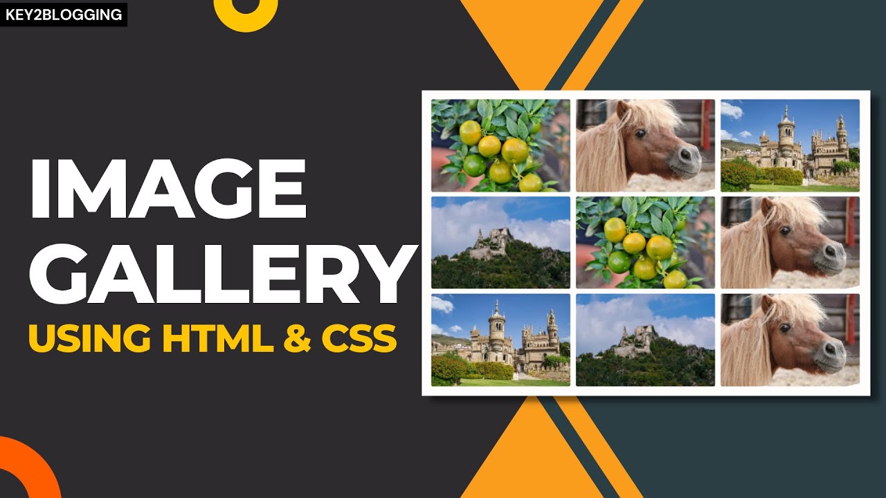
Image Gallery With Filter tabs (+Lightbox)
An image gallery with filter tabs and a lightbox feature allows users to easily sort and view images in greater detail. The filter tabs enable categorization, letting visitors quickly find specific types of images, while the lightbox provides a larger, often zoomable, view without leaving the page. This combination enhances user experience on websites by improving image presentation and navigation.
<div class="gallery-container">
<h2>Image Gallery</h2>
<p>Filter your Gallery with simple tab Buttons</p>
<div class="filter-buttons">
<button type="button" class="filter-btn active" data-filter="all">All</button>
<button type="button" class="filter-btn" data-filter="Forest">Forest</button>
<button type="button" class="filter-btn" data-filter="Mountain">Mountain</button>
<button type="button" class="filter-btn" data-filter="Sky">Sky</button>
</div>
<div class="gallery-grid">
<div class="gallery-item Forest">
<img src="https://images.unsplash.com/photo-1476231682828-37e571bc172f?q=80&w=1074&auto=format&fit=crop&ixlib=rb-4.1.0&ixid=M3wxMjA3fDB8MHxwaG90by1wYWdlfHx8fGVufDB8fHx8fA%3D%3D" alt="Image 1" />
</div>
<div class="gallery-item Mountain">
<img src="https://images.unsplash.com/photo-1761857570544-83c168b5455b?q=80&w=1113&auto=format&fit=crop&ixlib=rb-4.1.0&ixid=M3wxMjA3fDB8MHxwaG90by1wYWdlfHx8fGVufDB8fHx8fA%3D%3D" alt="Image 2" />
</div>
<div class="gallery-item Sky">
<img src="https://images.unsplash.com/photo-1514454529242-9e4677563e7b?q=80&w=1170&auto=format&fit=crop&ixlib=rb-4.1.0&ixid=M3wxMjA3fDB8MHxwaG90by1wYWdlfHx8fGVufDB8fHx8fA%3D%3D" alt="Image 3" />
</div>
<div class="gallery-item Forest">
<img src="https://images.unsplash.com/photo-1511884642898-4c92249e20b6?q=80&w=1170&auto=format&fit=crop&ixlib=rb-4.1.0&ixid=M3wxMjA3fDB8MHxwaG90by1wYWdlfHx8fGVufDB8fHx8fA%3D%3D" alt="Image 4" />
</div>
<div class="gallery-item Forest">
<img src="https://images.unsplash.com/photo-1542273917363-3b1817f69a2d?q=80&w=1174&auto=format&fit=crop&ixlib=rb-4.1.0&ixid=M3wxMjA3fDB8MHxwaG90by1wYWdlfHx8fGVufDB8fHx8fA%3D%3D" alt="Image 5" />
</div>
<div class="gallery-item Mountain">
<img src="https://plus.unsplash.com/premium_photo-1673240367277-e1d394465b56?q=80&w=1169&auto=format&fit=crop&ixlib=rb-4.1.0&ixid=M3wxMjA3fDB8MHxwaG90by1wYWdlfHx8fGVufDB8fHx8fA%3D%3D" alt="Image 6" />
</div>
<!-- Add More Images Here -->
</div>
</div>
<style>
.gallery-container {
max-width: 1140px;
margin: 0 auto;
text-align: center;
}
.gallery-container p {
color: #6c757d;
font-size: 1rem;
margin-bottom: 12px;
margin-top: 15px;
}
.filter-buttons {
margin-bottom: 50px;
position: relative;
z-index: 100;
}
.filter-btn {
background-color: #e9ecef;
border: none;
font-size: 16px;
color: #6c757d;
padding: 12px 24px;
margin: 5px;
cursor: pointer;
border-radius: 4px;
font-weight: 500;
transition: all 0.3s ease;
}
@media (max-width: 600px) {
.filter-btn {
padding: 12px 15px;
}
}
.filter-btn:hover {
background-color: #212529;
color: white;
}
.filter-btn.active {
background-color: #212529;
color: #fff;
}
.gallery-grid {
display: grid;
grid-template-columns: repeat(auto-fill, minmax(300px, 1fr));
gap: 25px;
}
.gallery-item {
border-radius: 16px;
box-shadow: 0 5px 20px rgba(0, 0, 0, 0.07);
overflow: hidden;
transition: transform 0.3s ease, box-shadow 0.3s ease;
}
.gallery-item:hover {
transform: translateY(-5px);
box-shadow: 0 10px 25px rgba(0, 0, 0, 0.1);
}
.gallery-item img {
width: 100%!important;
height: 100%!important;
display: block;
object-fit: cover;
}
.hidden {
display: none;
}
#custom-lightbox {
position: fixed;
top: 0;
left: 0;
width: 100%;
height: 100%;
background: rgba(0, 0, 0, 0.9);
z-index: 2147483647;
display: none;
justify-content: center;
align-items: center;
opacity: 0;
transition: opacity 0.3s ease;
-webkit-overflow-scrolling: touch;
}
#custom-lightbox.active {
display: flex;
opacity: 1;
}
#custom-lightbox img {
max-width: 95%;
max-height: 80vh;
border-radius: 4px;
box-shadow: 0 0 20px rgba(0,0,0,0.8);
object-fit: contain;
}
#lightbox-close {
position: absolute;
top: 20px;
right: 20px;
color: white;
font-size: 35px;
cursor: pointer;
background: rgba(0,0,0,0.5);
width: 40px;
height: 40px;
line-height: 40px;
text-align: center;
border-radius: 50%;
user-select: none;
}
.gallery-item img {
cursor: pointer;
}
</style>
<script>
document.addEventListener("DOMContentLoaded", function () {
const filterButtons = document.querySelectorAll(".filter-btn");
const galleryItems = document.querySelectorAll(".gallery-item");
filterButtons.forEach((button) => {
button.addEventListener("click", function (e) {
filterButtons.forEach((btn) => btn.classList.remove("active"));
this.classList.add("active");
const filterValue = this.dataset.filter;
galleryItems.forEach((item) => {
if (filterValue === "all" || item.classList.contains(filterValue)) {
item.classList.remove("hidden");
} else {
item.classList.add("hidden");
}
});
});
});
});
document.addEventListener("DOMContentLoaded", function () {
const lightbox = document.createElement('div');
lightbox.id = 'custom-lightbox';
document.body.appendChild(lightbox);
const lightboxImg = document.createElement('img');
lightbox.appendChild(lightboxImg);
const closeBtn = document.createElement('span');
closeBtn.id = 'lightbox-close';
closeBtn.innerHTML = '×';
lightbox.appendChild(closeBtn);
const galleryGrid = document.querySelector('.gallery-grid');
if (galleryGrid) {
galleryGrid.addEventListener('click', function(e) {
if (e.target.tagName === 'IMG') {
e.preventDefault();
e.stopPropagation();
lightboxImg.src = e.target.src;
lightbox.classList.add('active');
}
});
}
lightbox.addEventListener('click', (e) => {
if (e.target !== lightboxImg) {
lightbox.classList.remove('active');
}
});
});
</script>
I hope you have successfully added the image gallery to your blogger website. If you have any doubts then you can ask me on Twitter or Telegram.
If you Like this content then share it on social media and Tag us. Thank You.


Thanks for a great tutorial – the code works well and both styles look great.
One area I’m having trouble with is with the gallery responsive display on a phone…the view on the desktop and tablet works well but not the phone – on the phone the pictures appear in one single full screen column. Is this related to the code, or perhaps an error on my end?
Thanks!