How to Create A Responsive Card Slider Using HTML, CSS & JavaScript
A modern blog design is not just about good content—it’s also about how you present it. One of the best ways to showcase posts, products, Team Members or featured content is by using a responsive card slider.
In this guide, I’ll show you step by step how to add a beautiful card slider in your Website. Don’t worry, it’s simple, and you don’t need to be a professional coder. Just follow along, copy-paste the code, and your slider will be live in minutes.
What is a Responsive Card Slider?
A card slider is a section on your website where multiple cards (like small boxes containing text, images, or links) slide horizontally.
The term responsive means the slider looks good on all devices:
- On desktops, you may see 3–4 cards at a time.
- On tablets, maybe 2 cards.
- On mobiles, it adjusts to show only 1 card.
This way, your content is always easy to browse no matter what device your visitor is using.
How to Add the Card Slider in Website
Go to Page or Post where you want to Add card slider and switch to HTML View.
Now use the code below and replace the Details like Profile image, Designation, Description and Profile Links.
<div class="team-slider">
<button id="left" class="team-arrow" aria-label="Previous">
<svg viewBox="0 0 24 24" aria-hidden="true" focusable="false">
<polyline points="15 6 9 12 15 18" stroke="currentColor" stroke-width="2" fill="none" stroke-linecap="round" stroke-linejoin="round"/>
</svg>
</button>
<ul class="team-carousel">
<li class="team-card">
<div class="team-img">
<img src="https://images.unsplash.com/photo-1633332755192-727a05c4013d?w=600&auto=format&fit=crop&q=60" alt="img" draggable="false">
</div>
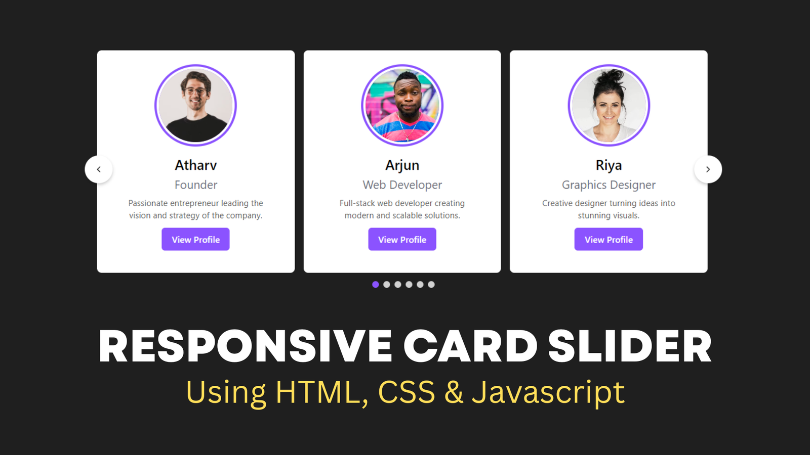
<h2>Atharv</h2>
<span>Founder</span>
<p class="team-desc">Passionate entrepreneur leading the vision and strategy of the company.</p>
<a target="_blank" rel="noopener noreferrer" href="https://example.com/atharv" class="team-btn">View Profile</a>
</li>
<li class="team-card">
<div class="team-img">
<img src="https://images.unsplash.com/photo-1463453091185-61582044d556?w=600&auto=format&fit=crop&q=60" alt="img" draggable="false">
</div>
<h2>Arjun</h2>
<span>Web Developer</span>
<p class="team-desc">Full-stack web developer creating modern and scalable solutions.</p>
<a target="_blank" rel="noopener noreferrer" href="https://example.com/atharv" class="team-btn">View Profile</a>
</li>
<li class="team-card">
<div class="team-img">
<img src="https://images.unsplash.com/photo-1580489944761-15a19d654956?w=600&auto=format&fit=crop&q=60" alt="img" draggable="false">
</div>
<h2>Riya</h2>
<span>Graphics Designer</span>
<p class="team-desc">Creative designer turning ideas into stunning visuals.</p>
<a target="_blank" rel="noopener noreferrer" href="https://example.com/Riya" class="team-btn">View Profile</a>
</li>
<li class="team-card">
<div class="team-img">
<img src="https://images.unsplash.com/photo-1507003211169-0a1dd7228f2d?w=600&auto=format&fit=crop&q=60" alt="img" draggable="false">
</div>
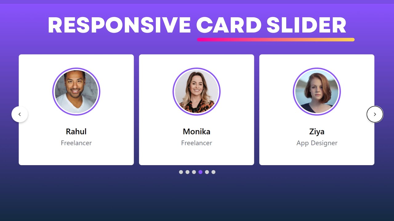
<h2>Rahul</h2>
<span>Freelancer</span>
<p class="team-desc">Freelancer with expertise in digital marketing and content creation.</p>
<a target="_blank" rel="noopener noreferrer" href="https://example.com/Rahul" class="team-btn">View Profile</a>
</li>
<li class="team-card">
<div class="team-img">
<img src="https://plus.unsplash.com/premium_photo-1688350808212-4e6908a03925?w=600&auto=format&fit=crop&q=60" alt="img" draggable="false">
</div>
<h2>Monika</h2>
<span>Freelancer</span>
<p class="team-desc">Freelancer specializing in UI/UX and responsive designs.</p>
<a target="_blank" rel="noopener noreferrer" href="https://example.com/Monika" class="team-btn">View Profile</a>
</li>
<li class="team-card">
<div class="team-img">
<img src="https://images.unsplash.com/photo-1438761681033-6461ffad8d80?w=600&auto=format&fit=crop&q=60" alt="img" draggable="false">
</div>
<h2>Ziya</h2>
<span>App Designer</span>
<p class="team-desc">App designer crafting intuitive and user-friendly mobile experiences.</p>
<a target="_blank" rel="noopener noreferrer" href="https://example.com/Ziya" class="team-btn">View Profile</a>
</li>
</ul>
<button id="right" class="team-arrow" aria-label="Next">
<svg viewBox="0 0 24 24" aria-hidden="true" focusable="false">
<polyline points="9 6 15 12 9 18" stroke="currentColor" stroke-width="2" fill="none" stroke-linecap="round" stroke-linejoin="round"/>
</svg>
</button>
<div class="team-dots"></div>
</div>
<style>
.team-slider {
max-width: 1100px;
width: 100%;
position: relative;
}
.team-arrow {
position: absolute;
top: 50%;
transform: translateY(-50%);
display: flex;
align-items: center;
justify-content: center;
width: 50px;
height: 50px;
padding: 0;
border-radius: 50%;
border: none;
background: #fff;
box-shadow: 0 3px 6px rgba(0,0,0,0.23);
cursor: pointer;
-webkit-appearance: none;
-moz-appearance: none;
appearance: none;
font-size: 0;
line-height: 0;
}
.team-arrow svg {
display: block;
width: 18px;
height: 18px;
}
.team-arrow { color: #222; }
.team-arrow#left { left: -22px; }
.team-arrow#right { right: -22px; }
.team-slider .team-carousel {
display: grid;
grid-auto-flow: column;
grid-auto-columns: calc((100% / 3) - 12px);
overflow-x: auto;
scroll-snap-type: x mandatory;
gap: 16px;
border-radius: 8px;
scroll-behavior: smooth;
scrollbar-width: none;
}
.team-carousel::-webkit-scrollbar {
display: none;
}
.team-carousel.no-transition {
scroll-behavior: auto;
}
.team-carousel.dragging {
scroll-snap-type: none;
scroll-behavior: auto;
}
.team-carousel.dragging .team-card {
cursor: grab;
user-select: none;
}
.team-carousel :where(.team-card, .team-img) {
display: flex;
justify-content: center;
align-items: center;
}
.team-carousel .team-card {
scroll-snap-align: start;
height: 400px;
list-style: none;
background: #fff;
cursor: pointer;
padding-bottom: 15px;
flex-direction: column;
border-radius: 8px;
}
.team-carousel .team-card .team-img {
background: #8b53ff;
height: 148px;
width: 148px;
border-radius: 50%;
overflow: hidden;
}
.team-card .team-img img {
width: 140px;
height: 140px;
border-radius: 50%;
object-fit: cover;
border: 4px solid #fff;
}
.team-carousel .team-card h2 {
font-weight: 500;
font-size: 1.56rem;
margin: 15px 0 5px;
}
.team-carousel .team-card span {
color: #6a6d78;
font-size: 1.31rem;
}
.team-card .team-desc {
font-size: 0.95rem;
color: #555;
text-align: center;
margin: 10px 40px 0;
line-height: 1.4;
}
.team-btn {
display: inline-block;
margin-top: 12px;
padding: 10px 18px;
background: #8b53ff;
color: #fff;
text-decoration: none;
border-radius: 6px;
font-size: 1rem;
font-weight: 500;
transition: background 0.3s;
}
.team-btn:hover {
background: #6a36d6;
}
@media screen and (max-width: 900px) {
.team-slider .team-carousel {
grid-auto-columns: calc((100% / 2) - 9px);
}
}
@media screen and (max-width: 600px) {
.team-slider .team-carousel {
grid-auto-columns: 100%;
}
}
.team-dots {
display: flex;
justify-content: center;
gap: 8px;
margin-top: 15px;
}
.team-dots .dot {
width: 12px;
height: 12px;
background: #d1d1d1;
border-radius: 50%;
cursor: pointer;
transition: background 0.3s;
}
.team-dots .dot.active {
background: #8b53ff;
}
</style>
<script>
const wrapper = document.querySelector(".team-slider");
const carousel = document.querySelector(".team-carousel");
const firstCardWidth = carousel.querySelector(".team-card").offsetWidth;
const arrowBtns = document.querySelectorAll(".team-slider button");
const dotsContainer = document.querySelector(".team-dots");
const carouselChildrens = [...carousel.children];
let isDragging = false, isAutoPlay = true, startX, startScrollLeft, timeoutId;
let cardPerView = Math.round(carousel.offsetWidth / firstCardWidth);
carouselChildrens.slice(-cardPerView).reverse().forEach(card => {
carousel.insertAdjacentHTML("afterbegin", card.outerHTML);
});
carouselChildrens.slice(0, cardPerView).forEach(card => {
carousel.insertAdjacentHTML("beforeend", card.outerHTML);
});
carousel.classList.add("no-transition");
carousel.scrollLeft = carousel.offsetWidth;
carousel.classList.remove("no-transition");
arrowBtns.forEach(btn => {
btn.addEventListener("click", () => {
carousel.scrollLeft += btn.id == "left" ? -firstCardWidth : firstCardWidth;
updateDots();
});
});
const dragStart = (e) => {
isDragging = true;
carousel.classList.add("dragging");
startX = e.pageX;
startScrollLeft = carousel.scrollLeft;
}
const dragging = (e) => {
if(!isDragging) return;
carousel.scrollLeft = startScrollLeft - (e.pageX - startX);
}
const dragStop = () => {
isDragging = false;
carousel.classList.remove("dragging");
}
const infiniteScroll = () => {
if(carousel.scrollLeft === 0) {
carousel.classList.add("no-transition");
carousel.scrollLeft = carousel.scrollWidth - (2 * carousel.offsetWidth);
carousel.classList.remove("no-transition");
}
else if(Math.ceil(carousel.scrollLeft) === carousel.scrollWidth - carousel.offsetWidth) {
carousel.classList.add("no-transition");
carousel.scrollLeft = carousel.offsetWidth;
carousel.classList.remove("no-transition");
}
clearTimeout(timeoutId);
if(!wrapper.matches(":hover")) autoPlay();
updateDots();
}
const autoPlay = () => {
if(window.innerWidth < 800 || !isAutoPlay) return;
timeoutId = setTimeout(() => {
carousel.scrollLeft += firstCardWidth;
updateDots();
}, 2500);
}
let totalCards = carouselChildrens.length;
for(let i=0; i<totalCards; i++) {
const dot = document.createElement("div");
dot.classList.add("dot");
if(i === 0) dot.classList.add("active");
dot.addEventListener("click", () => {
carousel.scrollLeft = (i + cardPerView) * firstCardWidth;
updateDots();
});
dotsContainer.appendChild(dot);
}
const updateDots = () => {
let currentIndex = Math.round(carousel.scrollLeft / firstCardWidth) - cardPerView;
if(currentIndex >= totalCards) currentIndex = 0;
if(currentIndex < 0) currentIndex = totalCards - 1;
document.querySelectorAll(".team-dots .dot").forEach((dot, idx) => {
dot.classList.toggle("active", idx === currentIndex);
});
}
autoPlay();
carousel.addEventListener("mousedown", dragStart);
carousel.addEventListener("mousemove", dragging);
document.addEventListener("mouseup", dragStop);
carousel.addEventListener("scroll", infiniteScroll);
wrapper.addEventListener("mouseenter", () => clearTimeout(timeoutId));
wrapper.addEventListener("mouseleave", autoPlay);
</script>Now you need to Adjust the Max width of the slider and adjust the size of individual cards on the slider. Follow the video to learn More.
Conclusion
That’s it! You’ve successfully added a responsive card slider in your website. This small design upgrade can make your blog look more professional, help you showcase important content, and keep your visitors engaged.
Try customizing the slider with your own colors, fonts, and cards to match your blog’s style.


Very good.